Banesto
brand restyling / visual identity / graphic system / art direction / academic projectBanestoBrand restyling
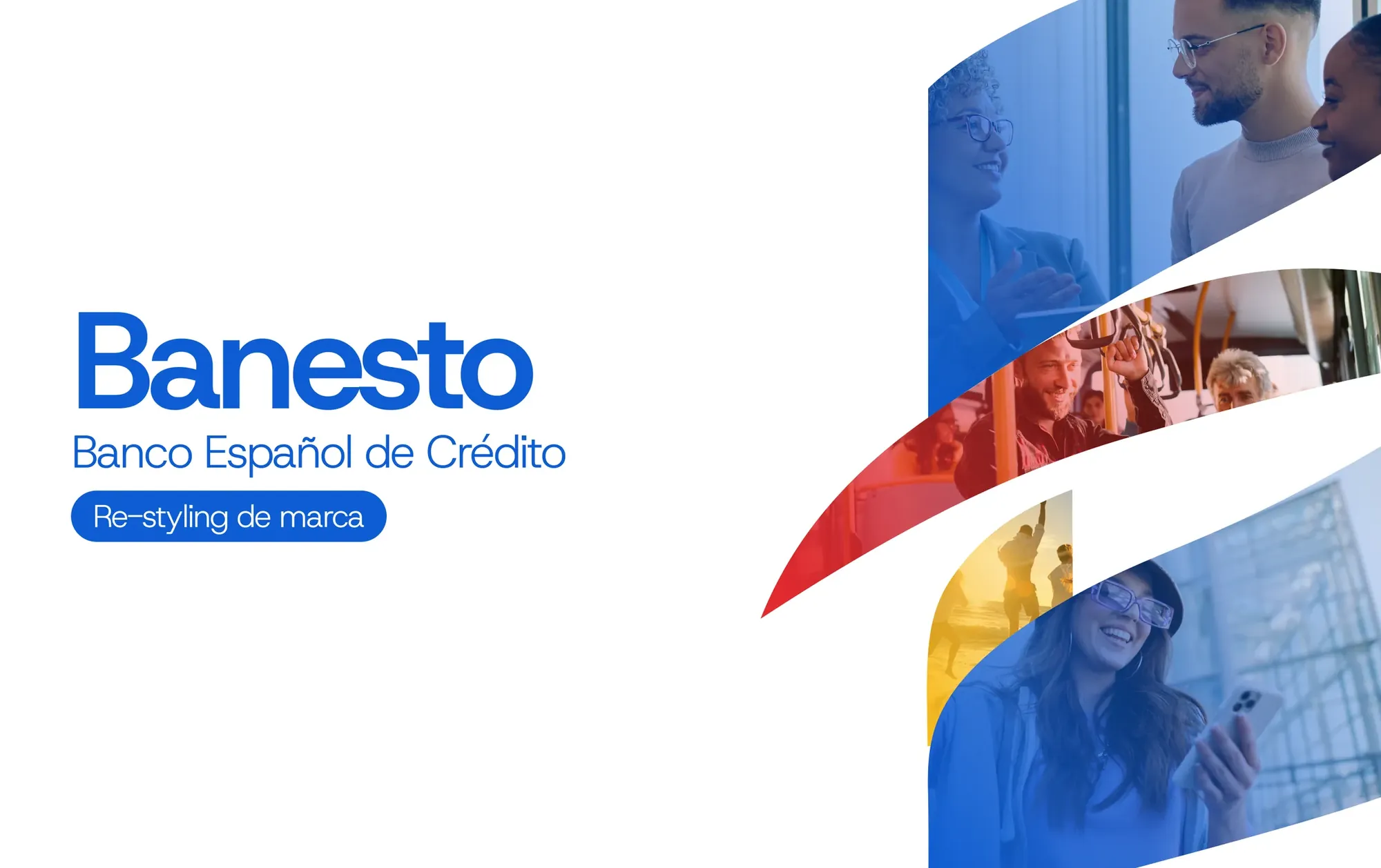
Banesto is back. For those who remember it and for those who never knew it.
Banco Español de Crédito was founded in 1902 and for 110 years it was one of Spain’s major banks. In 2013 it was absorbed into Santander and the brand disappeared. This restyling imagines its return: keep what people recognise and open it up to what comes next.
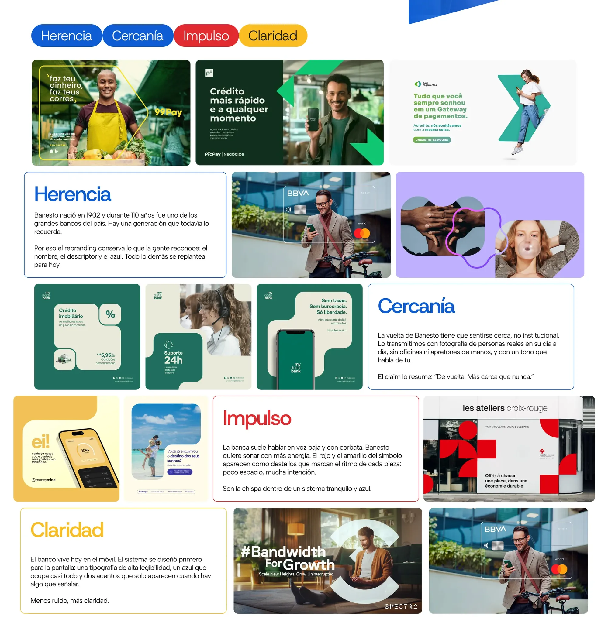
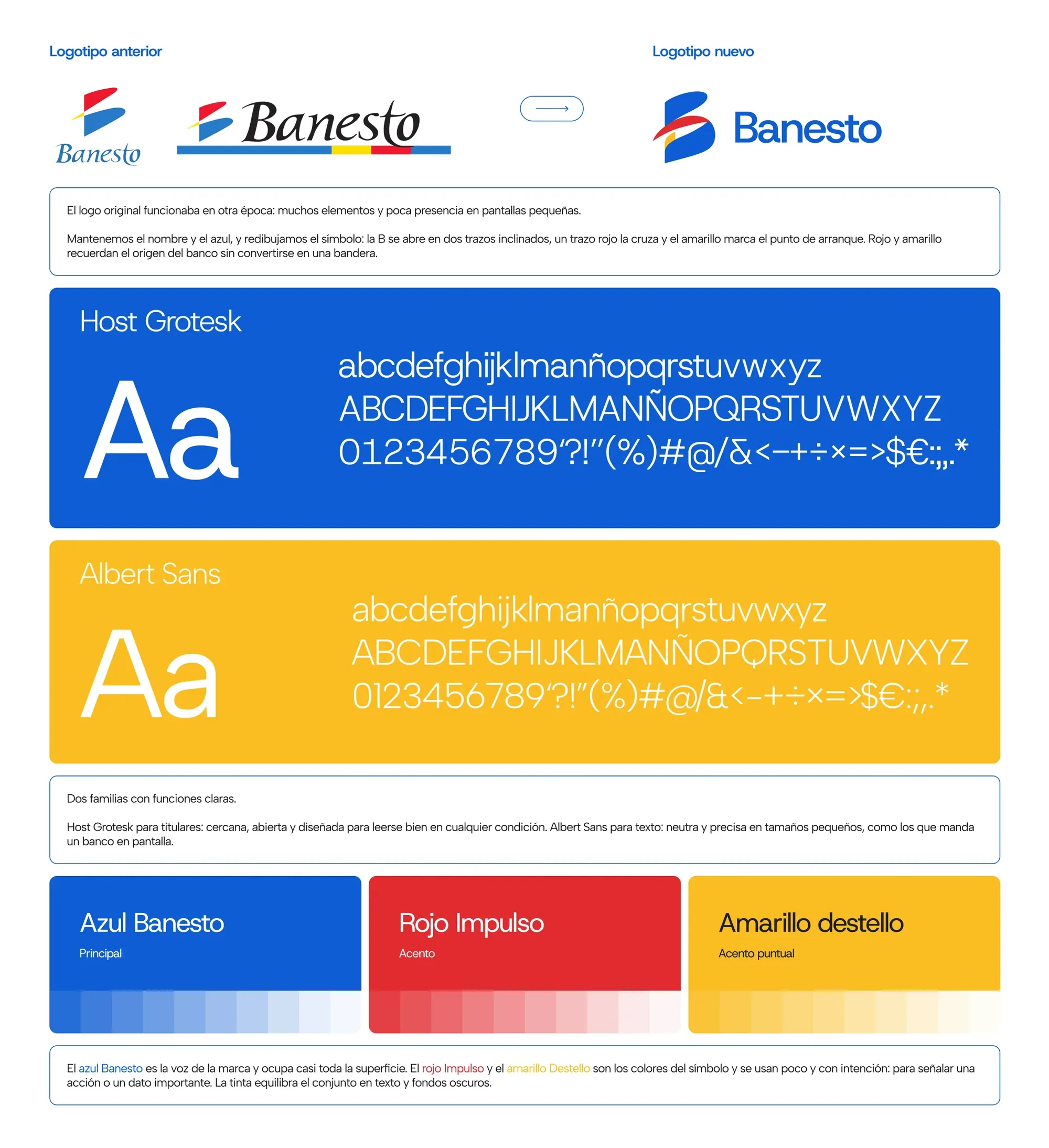
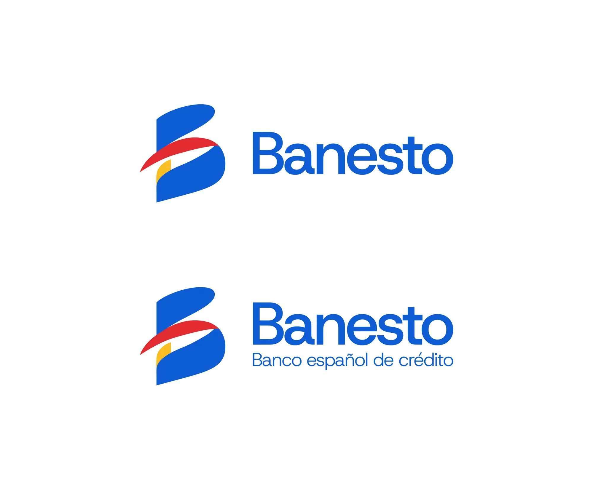
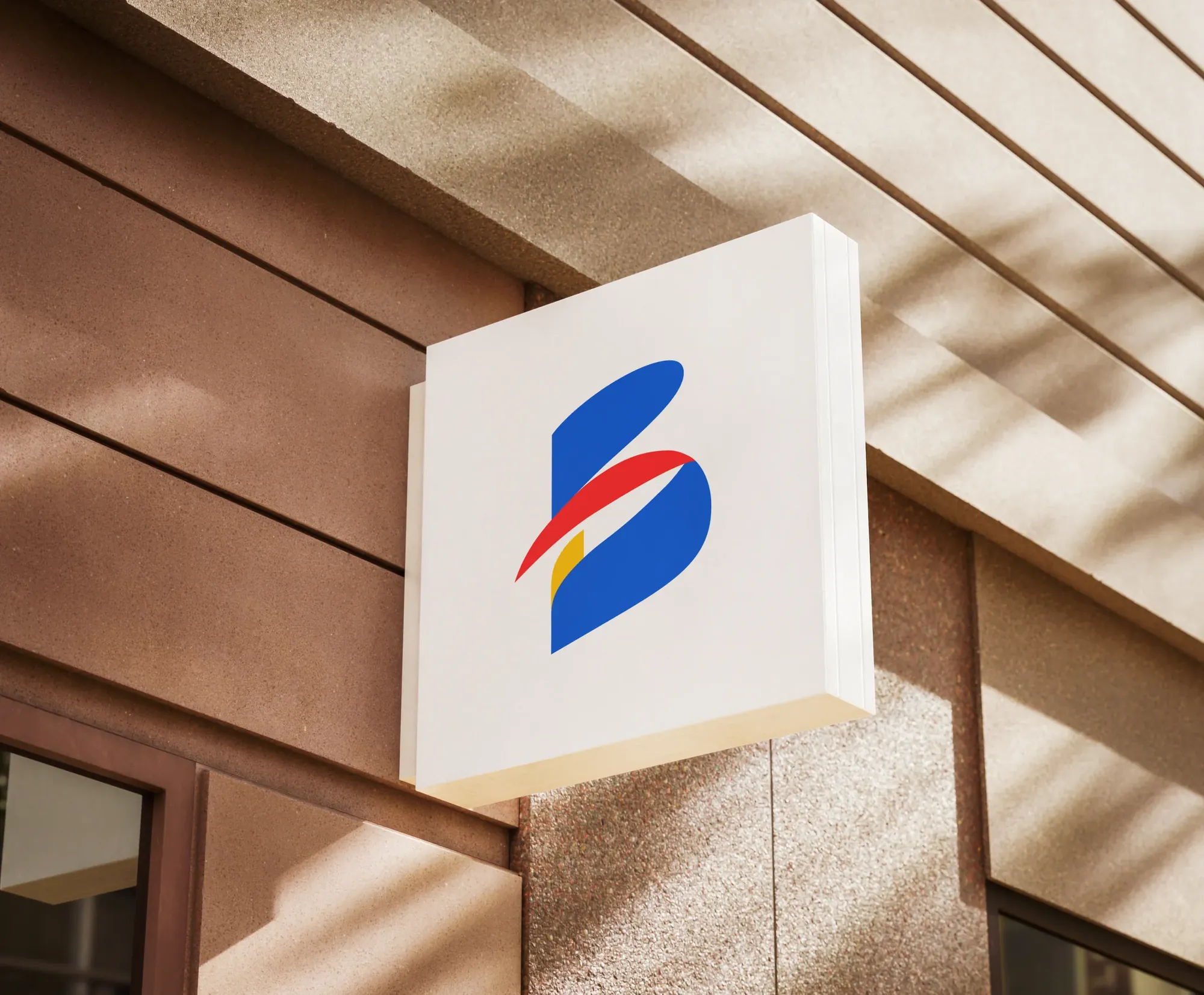
The name, the descriptor —Banco Español de Crédito— and the blue stay. The symbol opens up: the B goes from a closed seal to two forward-leaning strokes, a red line crosses it and a yellow spark marks the starting point. Red and yellow recall the origin without turning into a flag.
Four values organise the system: heritage, closeness, drive and clarity. Host Grotesk for headlines and Albert Sans for text, a blue that carries almost everything and two accents that only appear when there is something to point out. The claim sums it up: "Back. Closer than ever."
- Sector
- Banking
- Year
- 2026
- My role
- Art direction and graphic design
- Deliverables
- Brand restyling
- Visual identity
- Graphic system
- Applications
- Merchandise
- Stationery
Before and afterThe name, the blue and the B stay. The symbol, the typography and the tone change.
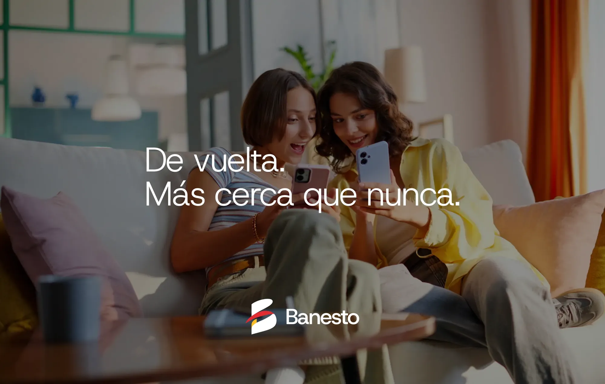
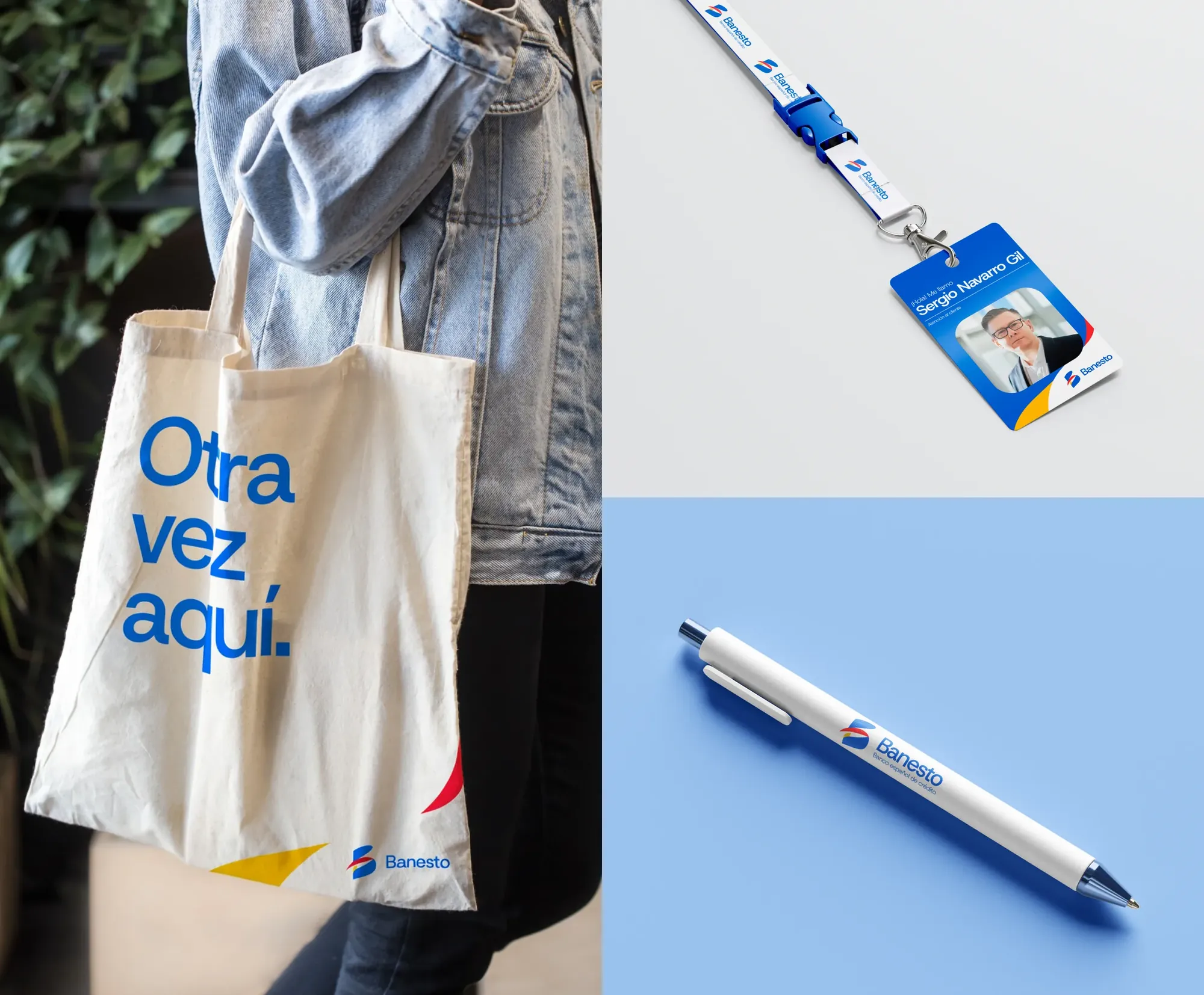
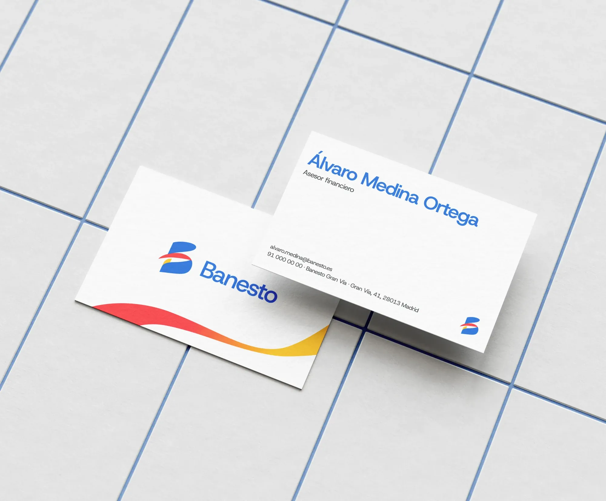
ApplicationsThe same system at every touchpoint: from the ATM to the card, from merchandise to the shopfront.

Like how I work?
Let’s talk next project
EL PAÍS